2019 Color Palette of the Year
It’s the beginning of 2019 which means Color of the Year is announced for every design guru on the planet to quickly scramble after and plaster on project surfaces. I, on the other hand, have Color Palette of the Year…because just one color is never enough.
2019 is, as I’d like to call it, Celebration of the Woman. I say that not only because 2018 was a year of embracing women and their fight, but because 2019 is the year we shine. Femininity will strut it’s way back into our households, boldly. Below are the six shades destined to dominate your Pinterest feeds in 2019.
ONE.
coral & rose
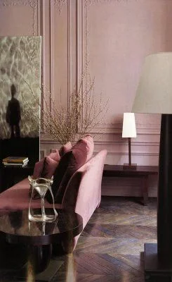
Pantone’s color of the year is Living Coral and I couldn’t agree more. We can thank Anthropologie and several years of neutral minimalism for this. And I’m very much on board. While I do find the shade of Living Coral to be a bit saturated, I think lighter versions and rusty rose are going to be all the rage, especially in velvet accents. What to pair it with? Any metal, textured & woven neutrals and shades of green and dusty blue.
Inspiration needed? Check out Luke Edward Hall, Sarah Sherman Samuel, SF Girl Bay, and Claire Zinnecker.
TWO.
cornflower Blue
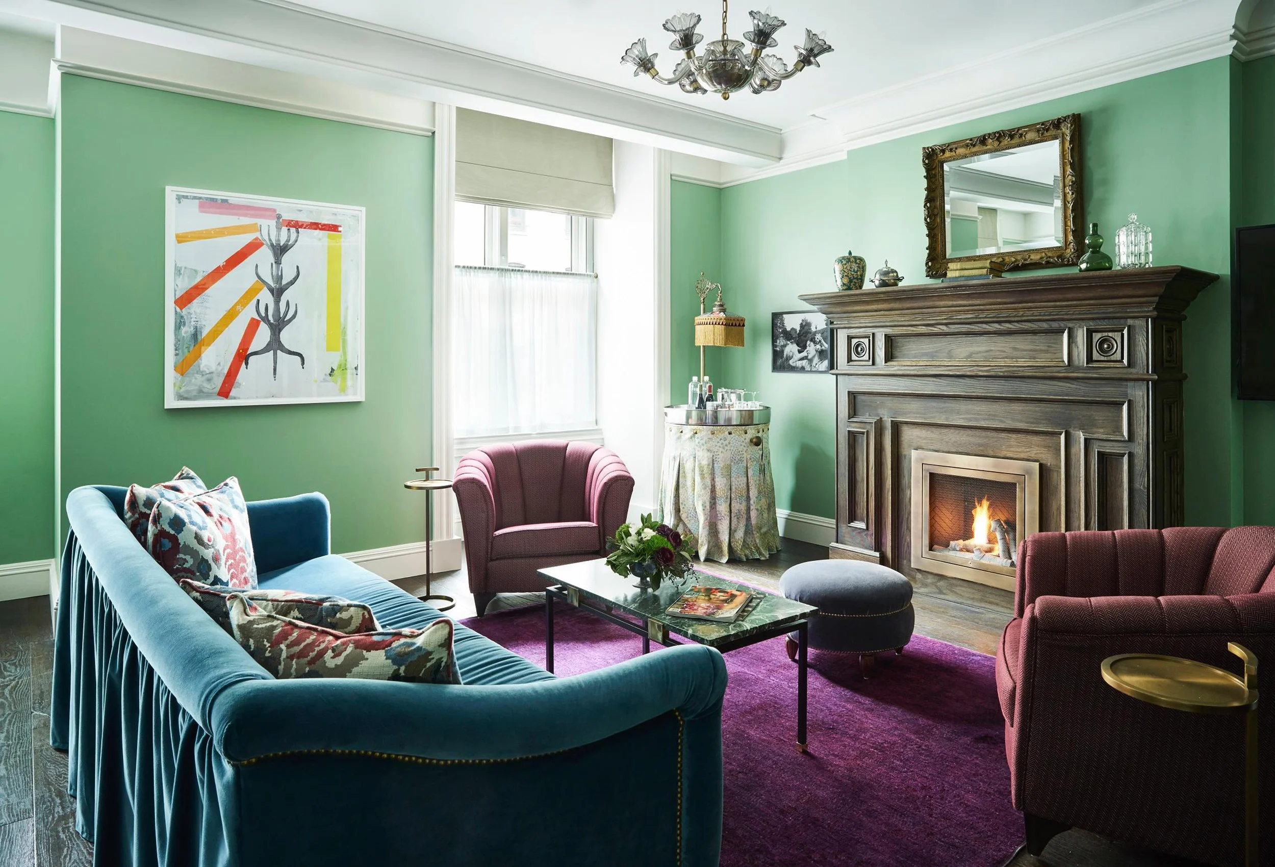
This crayola perplexed me the most as a child. Those of you savant color fiends, such as myself, know what I’m referring to. This crayon was far more waxy than the rest and required several hard-pressed layers to get the full effect. It often sat unused in my box. Now in adulthood I can fully appreciate it’s hue. Delightful, dainty, traditional, vintage. Somehow cauliflower can pull it all off. Clearly this shade radiates with plum, but also mixes well with shades of honey and wood.
Inspiration needed? Check out Emily Henderson, Miles Redd, and Kelly Wearstler.
THREE.
all the greens.
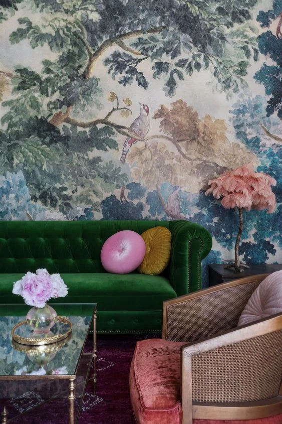
Moss, mint, teal, evergreen, chartreuse. Perhaps this family will be in my Color Palette of the Year each consecutive year, but that’s because it’s so good, each and every year. Saturated greens are hip, but also calming. They can go from country to rock & roll with the slightest movement on the color spectrum. Once a favorite, always a favorite.
Inspiration needed? Check out Erin Kestenbaum, Liz Kamarul and Guillermo Santoma.
FOUR.
moody jewel tones
This is for the undaunted adventurer, the bohemian, those with gumption. When done correctly, jewels are sultry and sexy and down right sophisticated. Every artsy atelier and downtown lounge is leaning on jewels.
Inspiration needed? Check out Miles Redd, Kelly Wearstler, Allison Crawford, Dimore Studio and Martyn Bullard.
FIVE.
earthy neutrals
Part of our love with neutrals is it’s innate ability to instantly soothe and relax. It also allows for some intense texture mixing, which I’m a huge advocate for. Gray was big the last few years, and while certainly clean, I think this year we’ll find ourselves reaching for warmth and tranquility. Pairing? While just about any color accentuates neutrals, my favorites for these shades are sage, mustard, terracotta, coral, and always a touch of stripe (in my book stripe is totally a color).
Inspiration needed? Check out Claire Brody, J Young Design House, McGrath, Marie Flanigan, Erica Reitman or Nate Berkus.
SIX.
florals
Femininity at it’s finest. I get it - 1. This isn’t really a color 2. It was all over the map last year. With that being said, I think this is the year we’ve got the guts to go big or go home. It’s not right for every space, but is my favorite in little nooks.
Inspiration needed? Check out Paloma Contreras and St Frank Textiles.
designer Photo Creds


